
Build what outlives you
A volunteer website for a nonprofit in River Falls, and why I judged the work by what happens after I step away.
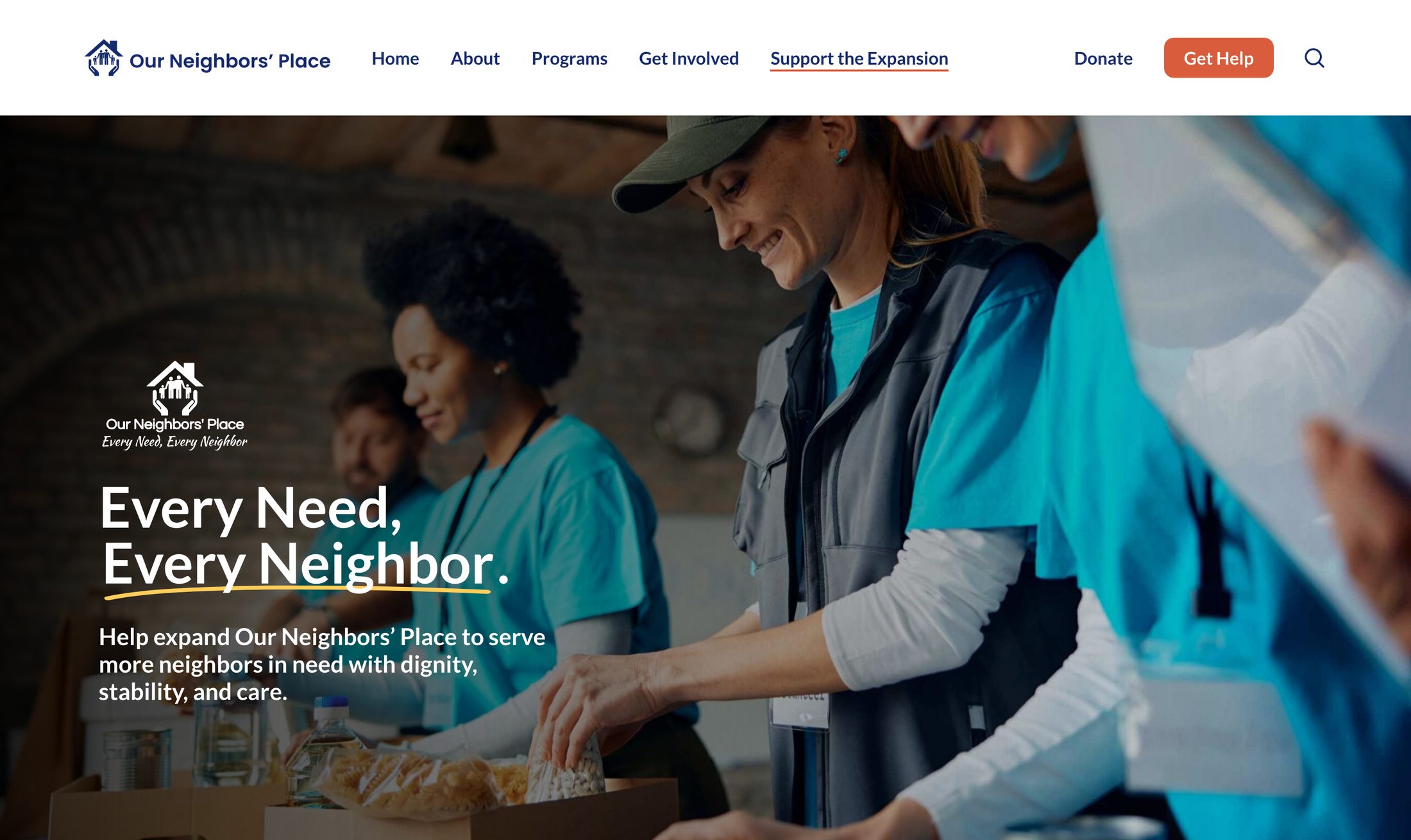
In early 2025, I reached out to Our Neighbors’ Place, a nonprofit in River Falls, Wisconsin, that helps people in St. Croix and Pierce Counties with food, clothing, housing and emergency support. After a quick consultation and discovery, I realized they were preparing for a capital campaign: demand for their services had grown more than 400% since 2015, and their building was no longer big enough for the people they serve.
I volunteered to support the campaign with a new website, and the existing site was in serious need of help.
The bigger constraint was capacity. Our Neighbors’ Place runs five programs with three full-time staff and 93 volunteers. Nobody there has spare hours to manage a website, and a volunteer doesn’t stay forever. If they couldn’t run the site on their own, it would just turn into the next old site, only newer looking.
So I held the work to one test: would it keep working after I stepped back?
Understand the system before you design for it
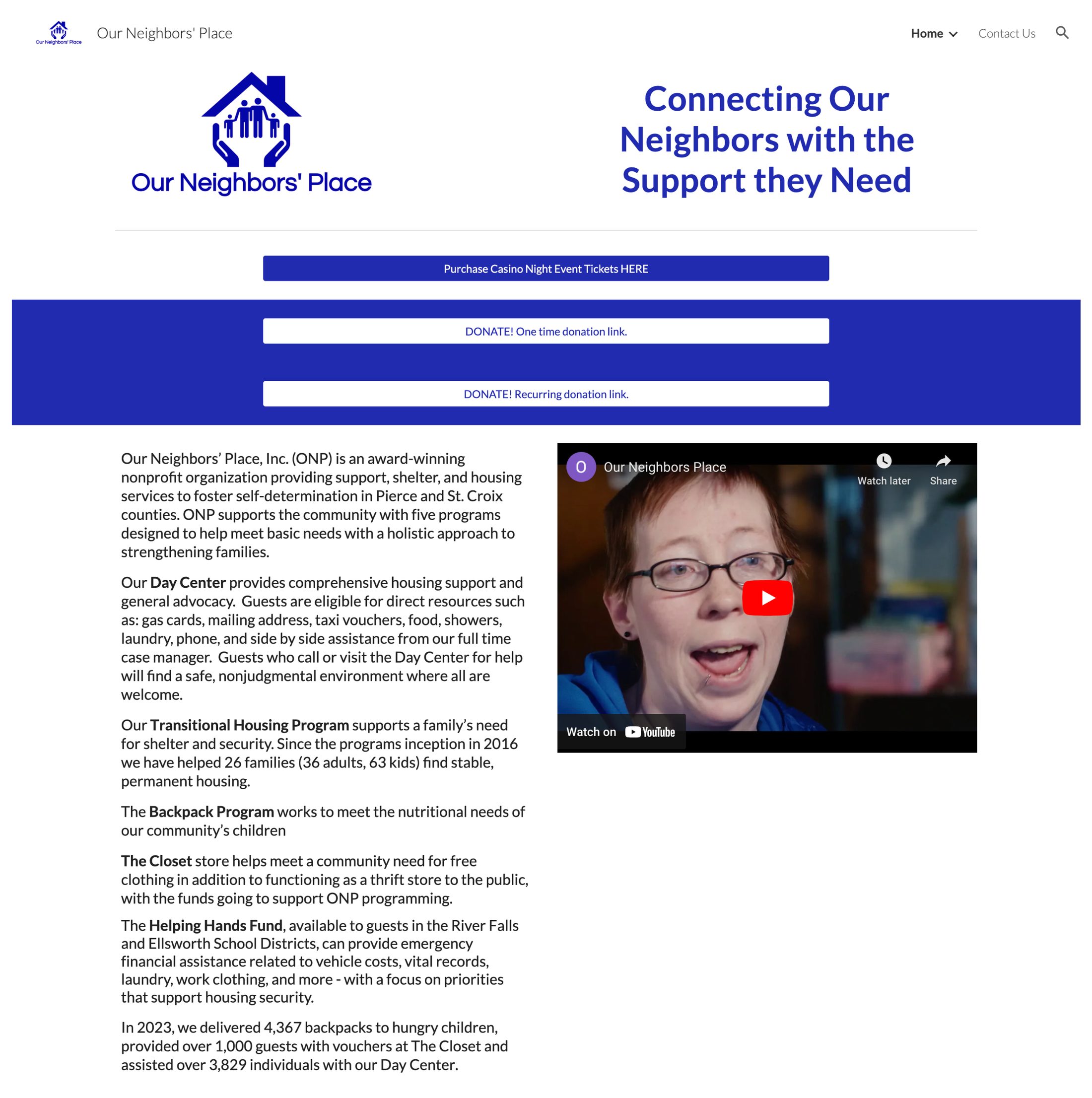
For Our Neighbors’ Place, the website had a lot of jobs. It was the front door for people looking for help, often on a phone. It was where donors would go to learn about the building, where volunteers signed up, and one more thing on the plate of a staff that already had plenty. The old site had started on Squarespace, moved to Google Sites, and showed the strain of being kept up by whoever had time. That’s normal for a small organization, and it told me where the real constraints were: time, technical comfort, and attention.
So before proposing anything, I did my homework. I sent Shelly Smith, the executive director, a discovery survey I’d already filled in from what I could learn on my own, so all she had to do was correct it instead of starting from a blank page. With it went a draft of what to say to each audience, a short primer on what a logo needs to work everywhere it shows up, and a recommendation on hosting. The pre-filled survey is something I’d do again on any project. When the person you need answers from is stretched thin, it’s a lot easier for them to react to something than to start from scratch.
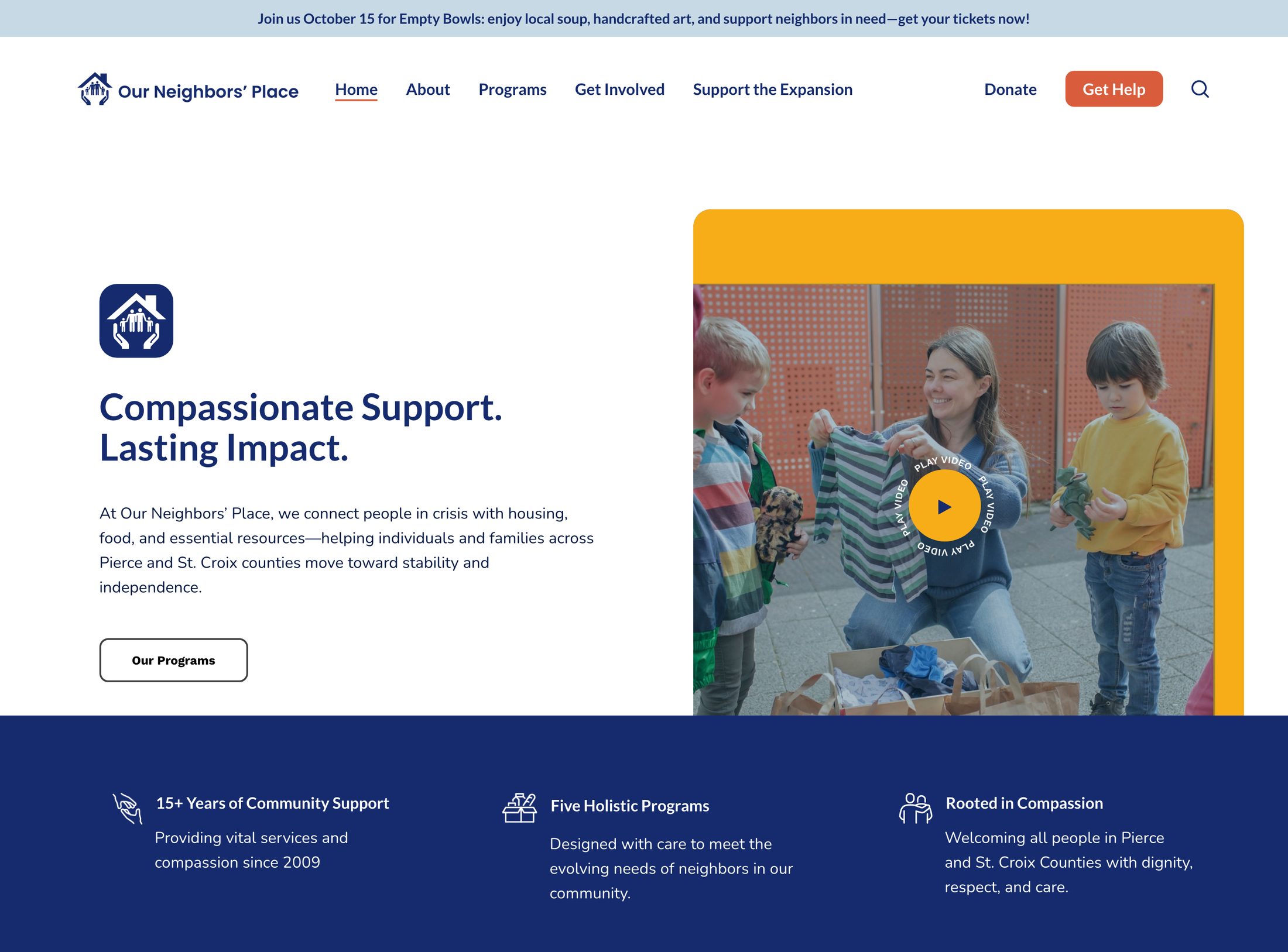
Looking at the whole picture shaped the site too. It serves people who need help and people who want to give it, so the header gives its one filled button to Get Help, with Donate right beside it. People who need help shouldn’t have to hunt for how to get it.
Give the people who own it real choices
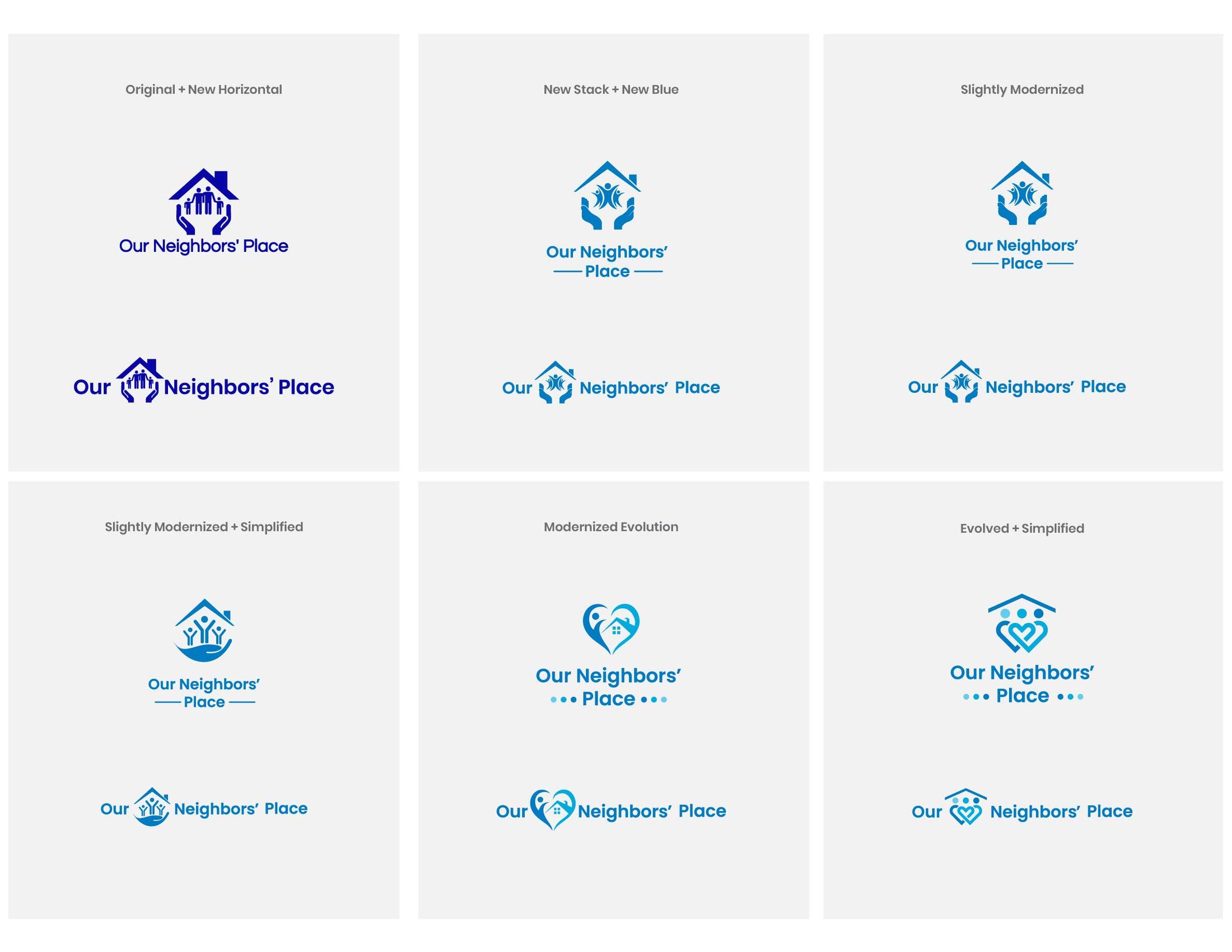
I explored six logo directions, from keeping the original house-and-hands mark and adding a horizontal version to two evolutions that folded shelter, heart and hands into a single symbol. Then I built three full brand directions, each with a palette, type, photography and a homepage mockup, because it’s hard to judge a palette from a swatch.
I also told them which decisions were easy to undo. Type and layout could be mixed across directions as the site came together. The palette would be costly to change once it was on everything, so that’s where I asked them to focus.
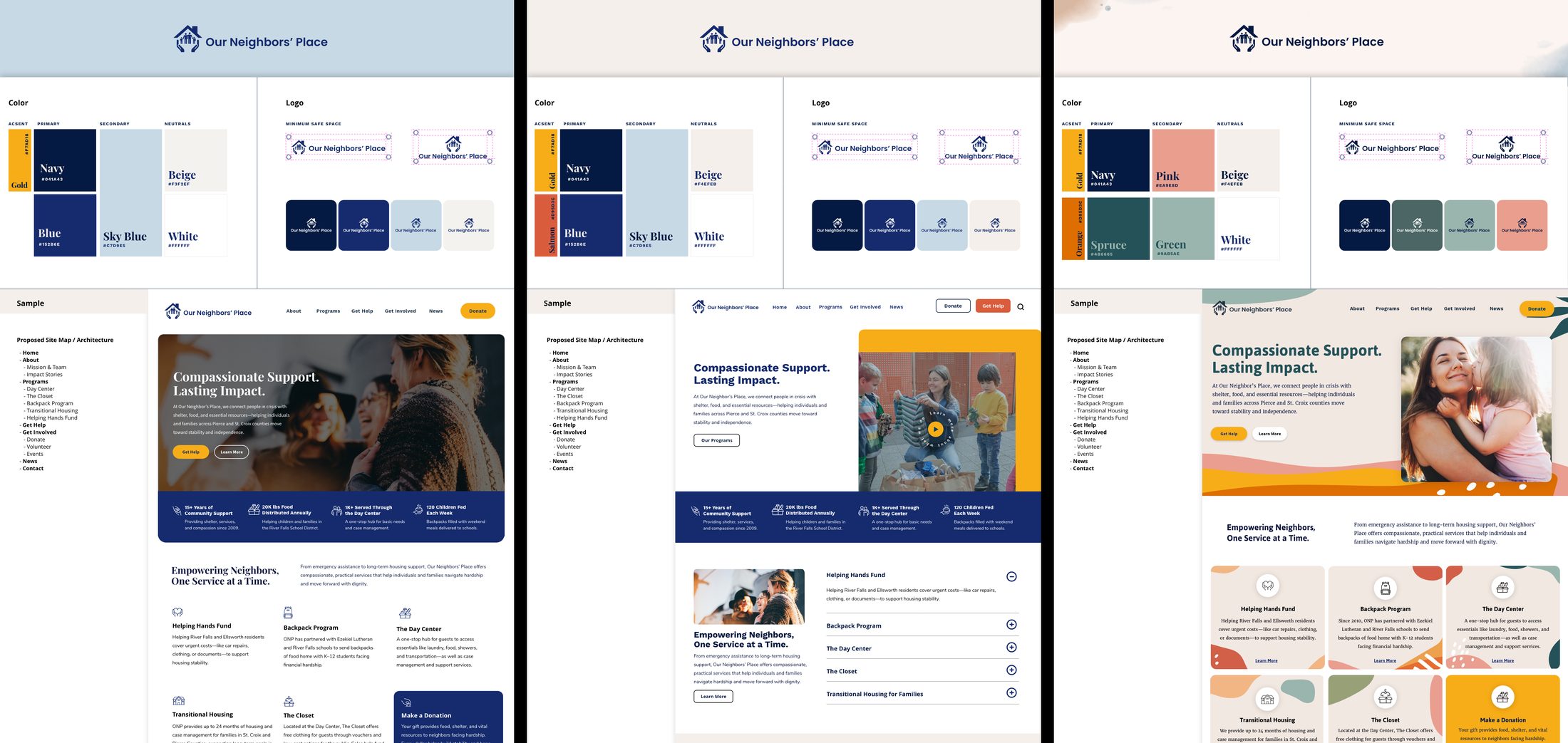
I preferred Direction C, which I’ve included here to show the exploration. They chose the direction that felt authentic to their community, and kept the original logo. My preference was one input, and they know their organization far better than I do. A brand the team picked is also one they’ll keep using after I’ve moved on.
Design for the day you leave
A lot of the decisions nobody sees were about the handover. I held every choice to the same question: could the staff run this without me? So they can try a change safely before anyone sees it, the site uses an editor that doesn’t need a technical background, and there are short training videos on the jobs they do most often. A year after launch, I came back with a short report on how the site was doing and one suggestion for year two.
The report also pointed to two things I’d plan for earlier next time. When a site is rebuilt, its old links need somewhere to go, and it’s worth deciding up front what the site should measure. Both are easy to push past launch and harder to sort out afterward. I’ve given the staff the steps for the first, and next time both go on the launch plan from the start.
What the year has shown
The most important result doesn’t show up in the analytics. Since launch, the staff have updated and maintained the site themselves. I’ve checked in only a handful of times, mostly for technical updates on the hosting side, and they’ve got it down. That was the whole point.
The first year also brought in more visitors than the old site’s last: about 4% more, viewing 15% more pages, with visits from search up 27% and from social media up about 70%. That comparison can’t separate the redesign from everything else that changed in a year, so I take it as a good sign, not proof.
The campaign reached its goal, and the new building is expected to open in spring 2027. I’m not taking credit for that. The community funded it, and the gifts are recorded in a system the website doesn’t see.
Why I volunteer
Whenever I can, I put my skills to work for a nonprofit in my own community. The same question runs through my day job, where I build the systems my design team works from: will this hold up without me in the room? At Our Neighbors’ Place, a year on, the answer is yes. A small staff runs their own front door without needing me to do it.
Figures compare US visitors over the old site’s last year and the new site’s first, counted from launch day. About 3,000 automated-looking visitors from outside the US are excluded.